id on colour harmonies

The topic of colour often gets little attention, yet the most eminent minds in the fields of physics, biology and psychology thought it worthy of their attention. The greatest artists spend a lifetime wrestling with colour and it has a cultural and artistic significance that is undeniable. An important step in handling colour confidently is to understand colour harmonies.
Here are just 7 principles based on the traditional colour wheel that will boost your colour comprehension.
The 7 Colour Harmonies this blog will explain:
The 7 Colour Harmonies this Blog will Explain
- Monochromatic
- Complementary
- Split Complementary
- Analogous
- Complementary Analogous
- Triadic
- Tetradic
1. Colour Harmony: Monochromatic
Monochromatic colour harmony uses one hue ( colour ) and tone variations of that colour.
The tonal variation creates contrast and therefore readability between the colours. Due to the fact that the colours are related, there is immediate harmony and a sense of cohesiveness between them.
Any hue can create a monochromatic harmony and here are some more examples:
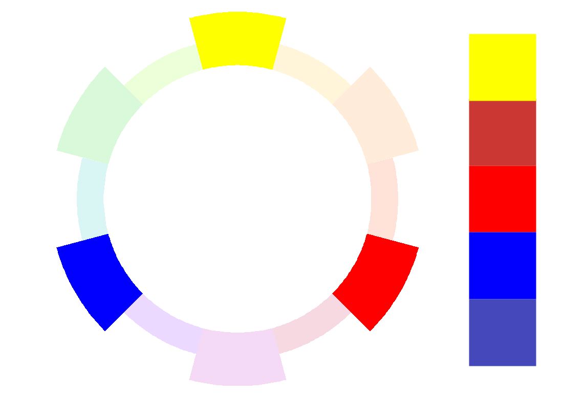
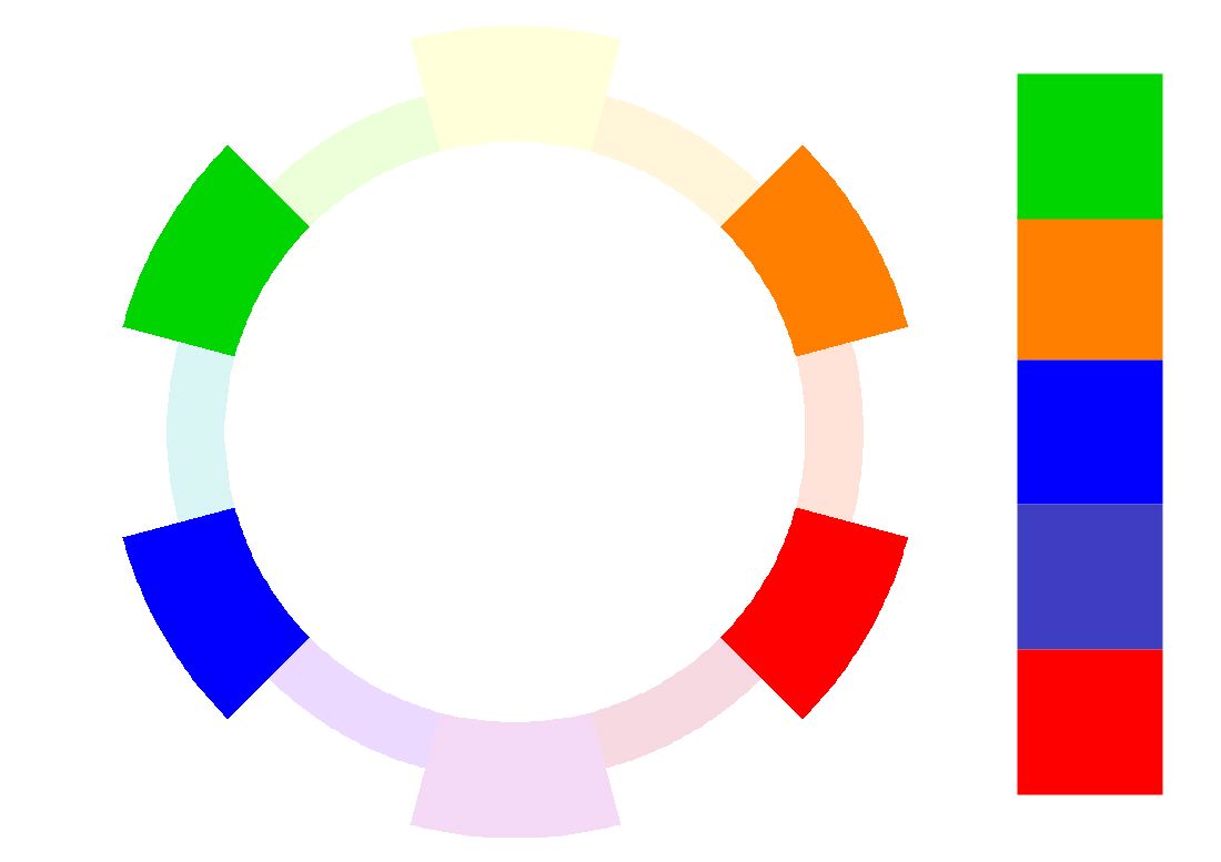
2. Colour Harmony: Complementary
This uses two hues ( colours ) from the opposite sides of the colour wheel.
Complementary colours are one primary and its opposite, a secondary colour which consists of the two remaining primary colours.
Complimentary colours provide maximum chromatic contrast or readability, because they are furthest apart on the traditional colour wheel.
Mixing these provides a range of reduced chroma versions, whereas an equal mix creates grey.
Complementary colours activate each other. This is because looking at just one will produce the other as an after-image when you then close your eyes. Also see our blog on colour contrast, in particular simultaneous contrast for more info.
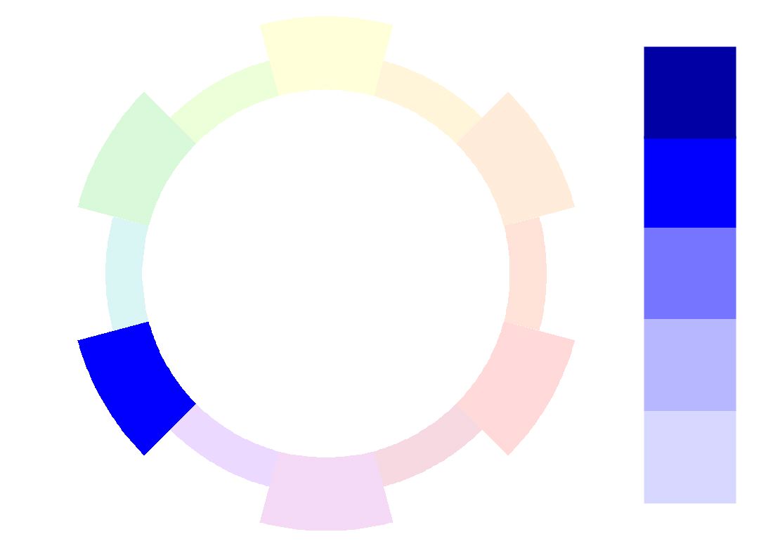
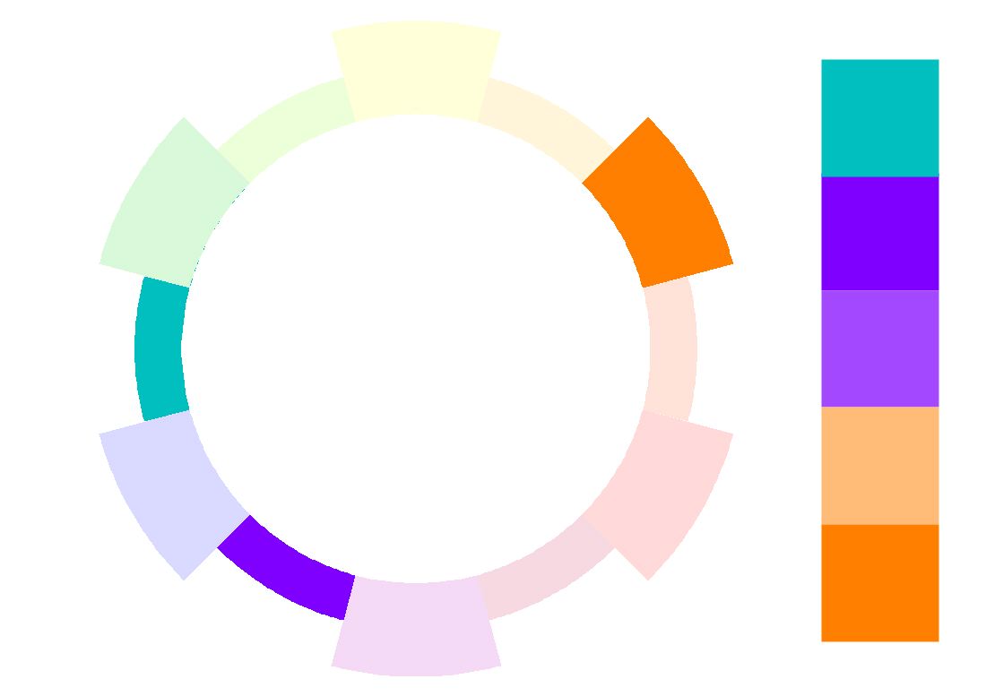
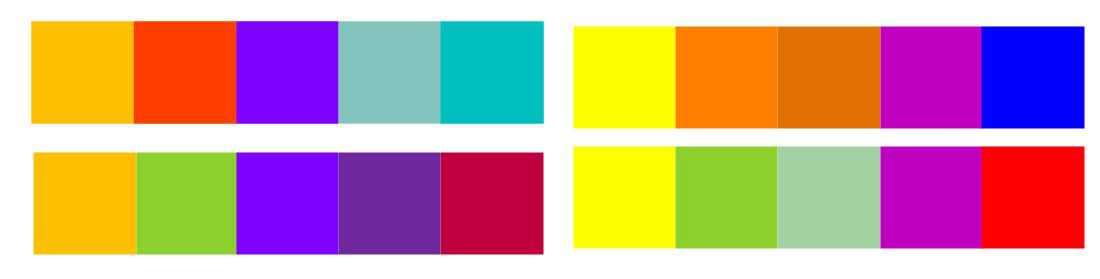
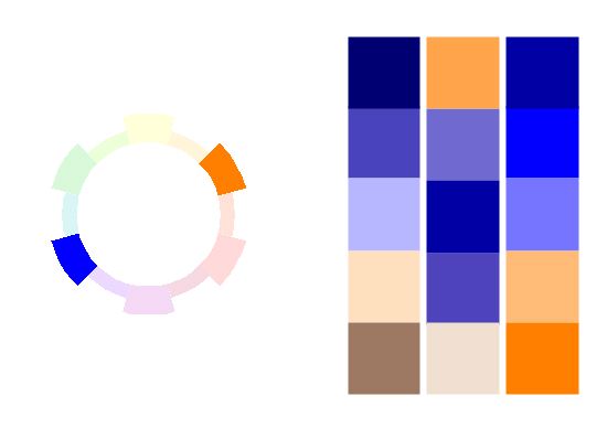
3. Colour Harmony: Split Complementary
For this scheme split one of the complementary hues into two close-by colours.
This provides two effects: Firstly it unifies due to the split or similar colours. Secondly it accents and contrasts through the complemantary side. This scheme expands the variations of a complementary one.
4. Colour Harmony: Analogous
This harmony uses three to four hues that are adjacent on the colour wheel and are therefore related.
Consequently, it creates immediately obvious colour harmony and there is less contrast.
A good scheme to emphasise a particular colour temperature, For example hot,cool.
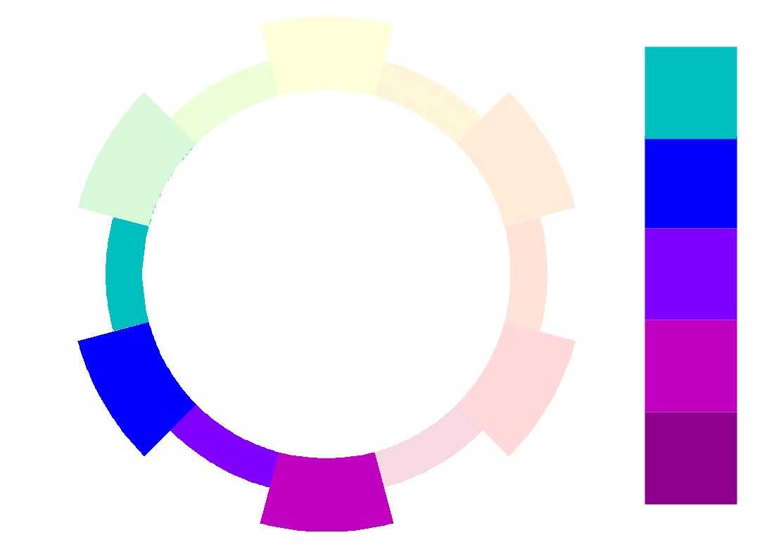
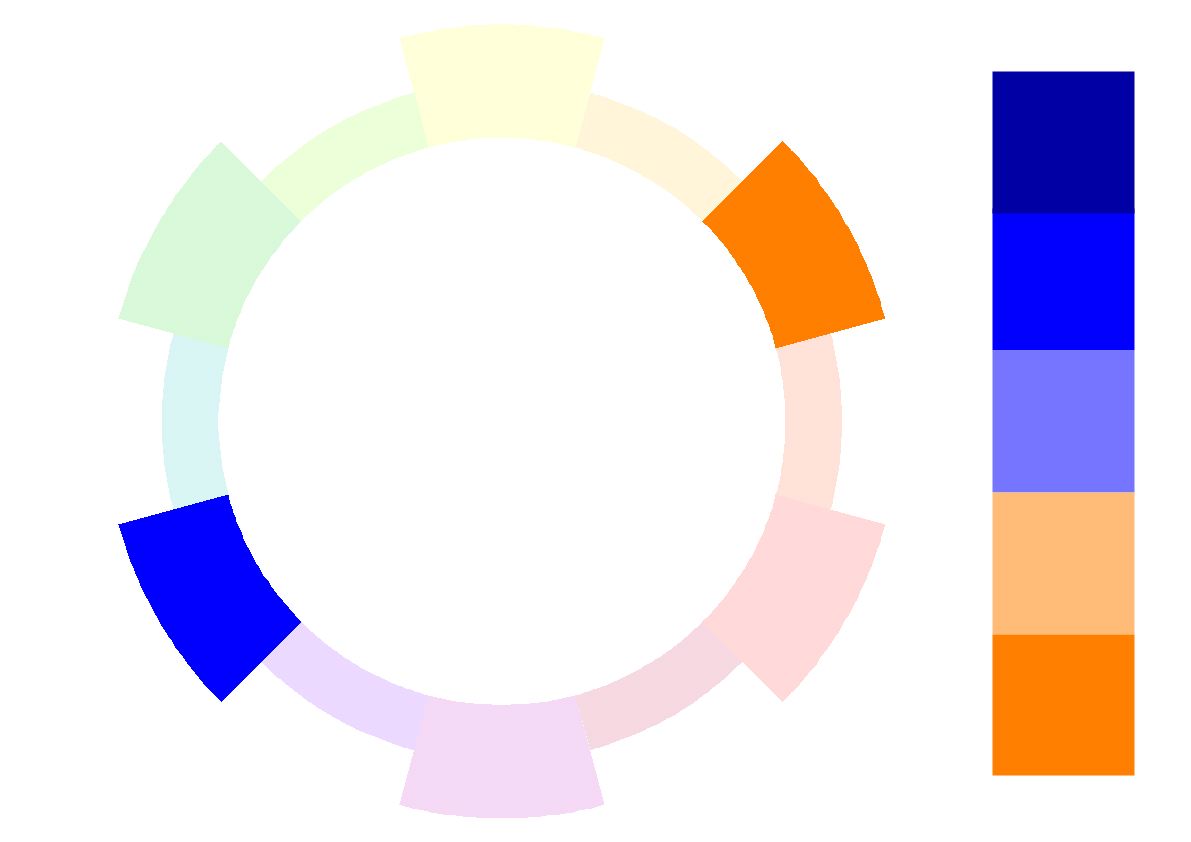
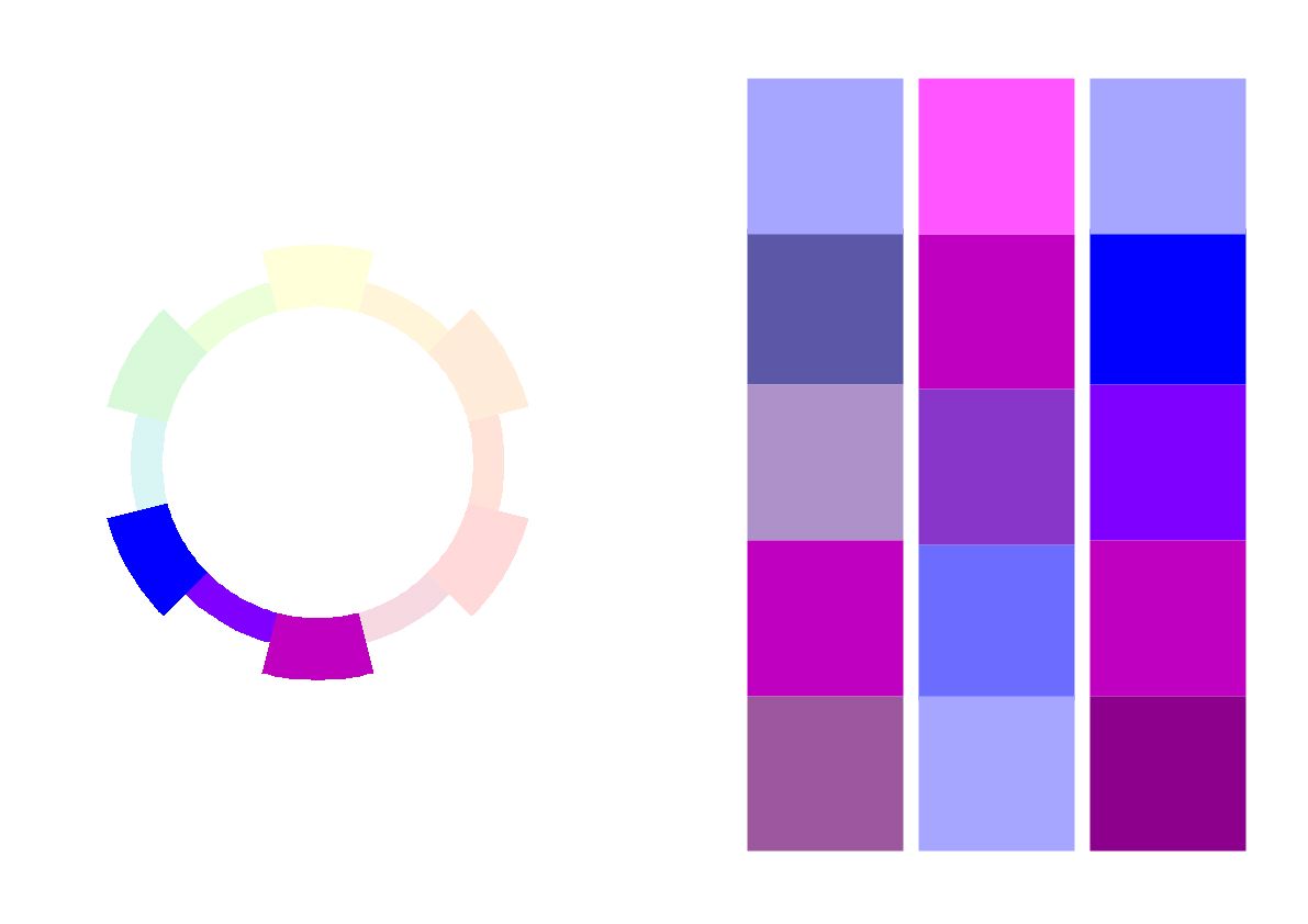
5. Colour Harmony: Complementary Analogous
As with the previous system, this one applies adjacent hues, but adds one complementary one.
It harmonises because of the hues that are close by. Furthermore it provides accent or balance with the complementary one.
Intermixing creates a wide range of lower chroma colours and greys.
6. Colour Harmony: Triadic
In this combination three hues that are equally spaced around the colour wheel are selected. The most known example are the three primary colours of red, yellow, blue.
As they are also in equal measure the furthest from each other, they have the most potential for strong and vibrant colour combinations.
Equally these produce the widest range of mixed colours and unique grays.
Its is both a contrasting and harmonious colour selection.
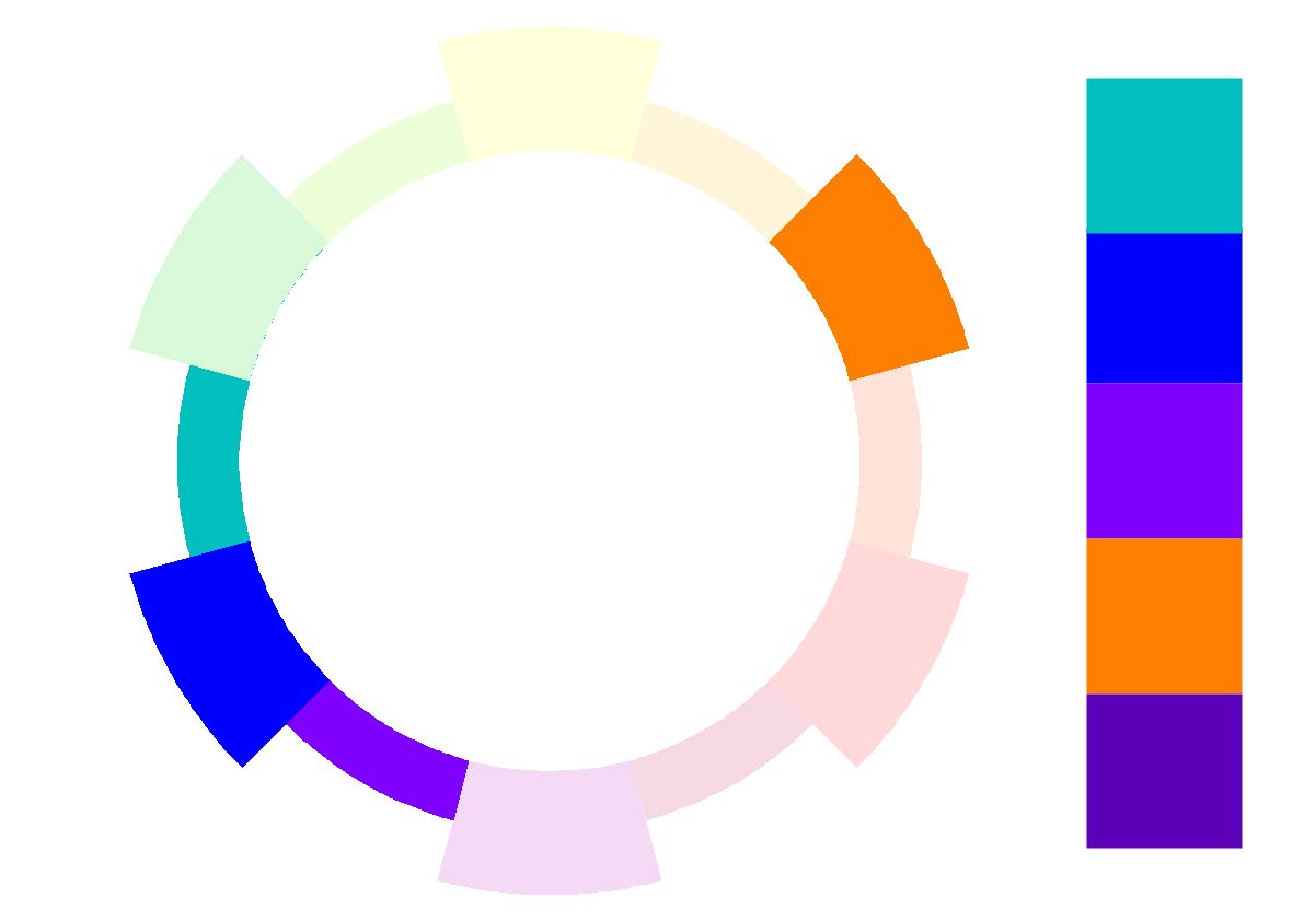
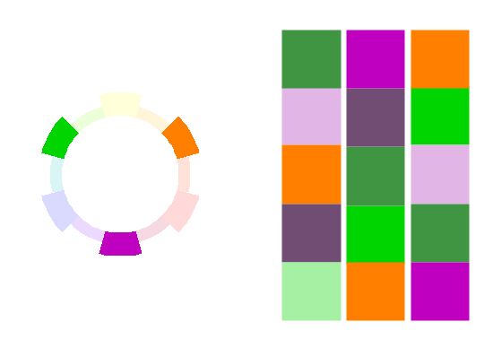
7. Colour Harmonies: Tetradic
In a tetradic harmony four hues are selected. These are made of two sets of complementary colours. Furthermore they are arranged in a rectangle around the colour wheel.
It is best when one dominant colour is used and the remaining ones act as accents.
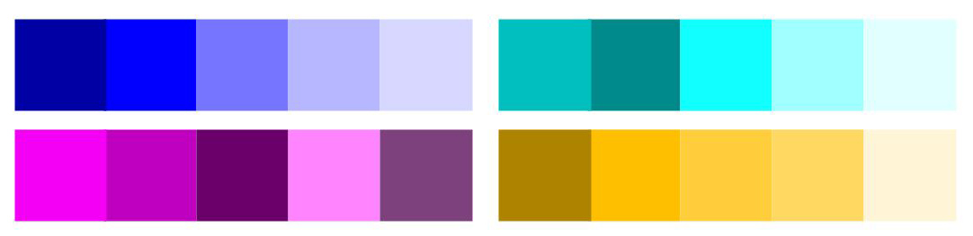
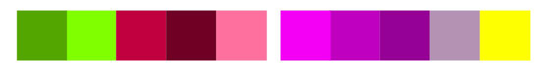
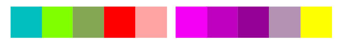
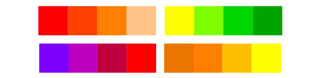
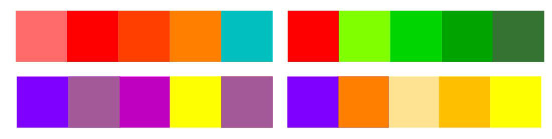
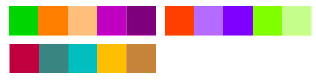
Further Variety on Colour Harmonies
Now that you know how to employ successful schemes, have fun creating innumerable variety by playing the full gamut of:
- Tone in Shades and Tints
- Chroma by mixing Hues for varied greys
- Colour intensities within any given colour scheme
Here is just a taster:
If you would like to re-familiarise yourself with colour properties of Hue, Tone, Chroma, Temperatures, then feel free to re-read my blog id on colour properties.
Also, don’t forget to subscribe, if you would like regular updates on colour, design and interiors.
Finally Some Tips for Creating Nice Schemes:
1: Use one dominant colour.
2: Use only a few colours.
3: Get inspired by colour palettes.
Finally a colour tool from adobe to help you make great choices.
Also check out our link to our blog colour systems if you would like to understand how to use different colour systems.