Blog

sustainable materials surface design show 2024 hero

id on sustainable materials

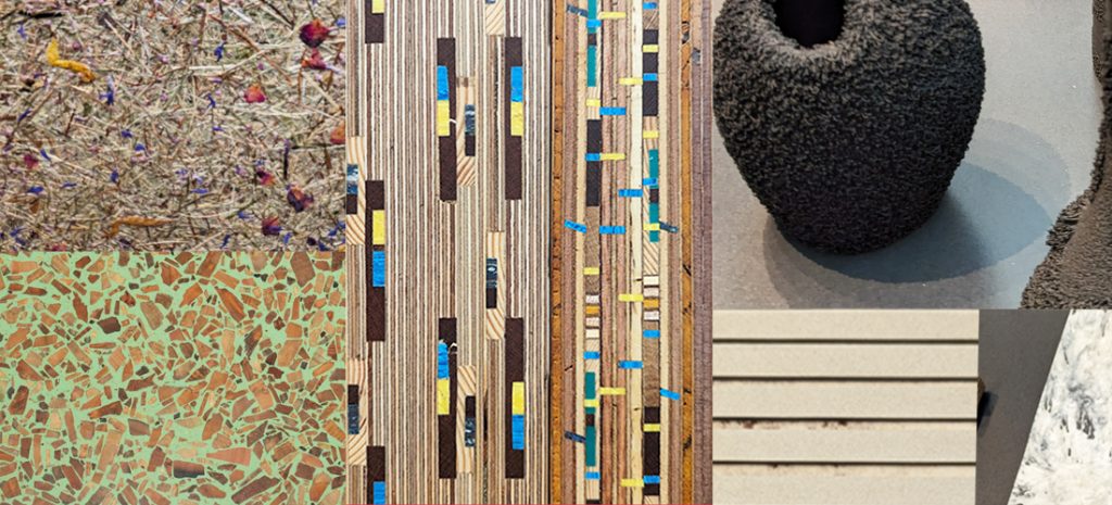
In view of a world where environmental concerns have become increasingly prominent, the call for sustainable practices has certainly never been louder. Indeed from reducing carbon footprints to minimizing waste, individuals and industries alike are seeking innovative solutions to mitigate their impact on the planet. At the core of good practices in design is the choice of sustainable materials.
Therefore, we explore the latest trends and material choices in this blog that got our attention at this year’s surface design show.

Feel free to share
colour contasts hero

id on colour contrast

Ever wondered why surgeons wear green scrubs? Colour contrast is elementary for visual perception. Without it, we could only see one tone or one colour.
The Swiss painter Johannes Itten and Bauhaus teacher described 7 of the colour contrasts that are supporting what we see. To complete the picture I have added two further ones, which respond to the way we see.
Colour contrasts are a powerful tool in art and design and have a great influence on the workplace, read on to find out more on how we perceive colours, how they interact and the reason why surgeons wear green scrubs.

Feel free to share

id on colour systems

Amethyst Showers – Bittersweet – Mole’s Breath?
You might be forgiven, if colour might not be the thirst thing that springs to mind on hearing these words, just a few evocative examples of naming colours.
4 main Colour Systems make working with colour straightforward and I will be explaining how they work and where they are used

Feel free to share

id on colour harmonies

The topic of colour often gets little attention, yet the most eminent minds in the fields of physics, biology and psychology thought it worthy of their attention, the greatest artists spend a lifetime wrestling with colour and it has a cultural and artistic significance that is undeniable.
An important step in handling colour confidently is to understand colour harmonies,
Here are just 7 principles based on the traditional colour wheel that will boost your colour comprehension.

Feel free to share
colour properties feature

id on colour properties

Colour has a unique fascination and this is no surprise, because it surrounds us everywhere. It is ubiquitous in our homes, in nature, in fashion and any media.
From early mankind there was an urge to pick up a colour, or rather a pigmented stone and paint your message to the world.
So why do we find colour so difficult to grasp? One of the answers might just be that just 4 colour properties create a myriad of colour possibilities and even more combinations. Furthermore we all have our personal preferences and it is quite likely that no two people will agree on one colour. Yet coming to grips with colour might be easier than you thought – just 4 colour properties – yes the very same that create so many possibilities – are the very key to unlocking the mysteries of colour.

Feel free to share
colour

id on colour

Confused about colour? Then my my series of blogs on colour basics might help you shed some light on this intriguing and wonderful subject.

Feel free to share