id on colour contrast

Ever wondered why surgeons wear green scrubs? Colour contrast is elementary for visual perception. Without it, we could only see one tone or one colour.
The Swiss painter Johannes Itten and Bauhaus teacher described 7 of the colour contrasts that are supporting what we see. To complete the picture I have added two further ones, which respond to the way we see.
Colour contrasts are a powerful tool in art and design and have a great influence on the workplace, read on to find out more on how we perceive colours, how they interact and the reason why surgeons wear green scrubs.
Colours are forces, radiant energies that affect us positively or negatively, whether we are aware of it or not.
Johannes Itten, Faber Birren (1970). “The Elements of Color”, p.12, John Wiley & Sons
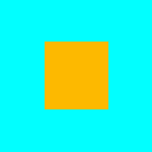
1. Colour Contrast of Hue
Itten calls this “Farbe an Sich” or colour in itself as a contrast. It sets strong colours against each other. To create it place hues that are relatively far apart on the traditional colour wheel next to one another.
Colourfulness is the main attraction and it is relatively easy to recognise.
It stands out most in primary and secondary colours. A minimum of two or three achieve the most stimulating effects. Therefore where the chroma is lower the response is lower, too.
This contrast can be seen well from a distance and we respond strongly to it. For this reason it is used in posters, signaling and safety signage.
PERCEPTION: colourful – positive – fun – happy – cheerful – strong – loud
Children recognize strong colours best. Consequently, it seems only natural, that primary colour names are some of the first words children learn.
To bring make the colours clearer, try separating them with white or black. In this way properties of hue and chroma can stand by themselves without influence from their neighbours. See also the examples below.
A careful balance between the attention this use of colour demands and a potential a sense of overload is important, so that the observer experience is as intended.
For more sublter examples of this colour contrast there are several options:
Strong Colour- Altered Colour
Intense chroma hues are set against colours of weaker chroma or colours that have been mixed with either white or black.
Colour – Greyscale
Contrasts between colourful and colours in the tonal grey range. Due to the weaker chroma, greys make colours stand out.
Weak Chroma – Weak Chroma
Less colourful colours of weaker chroma set next to each other also have a colour contrast by hue, but this is less intense than in higher chroma colours.
2. Colour Contrast of Light and Dark
Light and dark dominate the natural world and we are therefore very susceptible to it.
It is most recognisable as a black and white or tonal contrast. Most of us know this from black and white photography.
Light and dark exists as a contrast between pure colour hues, too. For this to work, and not just be a colour contrast of hue, there needs to be a difference of brightness between the hues. For instance, yellow against blue will make the yellow stand out.
Adding a tonal variation to colours by adding white or black will also create a light-dark contrast.

To read a light-dark contrast of colours, these need to be of a strong brightness or/and tonal difference.

PERCEPTION: light and shadow – day and night – extreme – dramatic – tension
USE IN ART AND DESIGN:
- Create form by rendering shadow through different scales of tone.
- Indicate directions and space by scaling from bright to dark tones.
- Generate tension or attention by highlighting one area against another. For example, chiaroscuro as seen in a Caravaggio painting uses a light-dark contrast.
3. Colour Contrast of Warm and Cold
Imagine some glacial ice, you will probably associate some sense of cold there as opposed to a glowing fire. The latter will create associations of warmth and most likely colours of red and orange.
We can understand this colour contrast from experience and on an emotional level. It is therefore a very important tool in art and design.
Usually, we identify blue-green as one of the coolest and orange-red as one of the warmest colours.


Colour properties of temperature are either in the cool or warm spectrum.
Equally each colour, apart from blue green and red orange, can be interpreted as cooler or warmer in the context of warmer or cooler colours. See also simultaneous contrast further on in this post.

Adding white or black will make warmer colours cooler and cooler colours warmer.
PERCEPTION:
- far to close – think aerial perspective
- airy-earthy
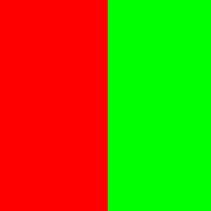
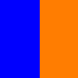
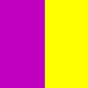
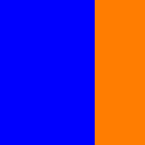
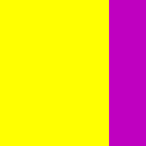
4. Colour Contrast of Complements
Complementary colours are those that oppose each other on the traditional colour wheel.
This chapter describes the effect of two colours, which are most different from each other. This means they are furthest apart or opposed on the traditional colour wheel.
These colours amplify and activate when placed next to one another. Both gain their strongest chromatic effect and luminosity in this way.
PERCEPTION:
colourful – lively – exciting – active – corresponding – fitting – harmonious – complete
5. Colour Contrast of Quantity
The quantity contrast expresses the area size of one colour against another. It could also be called a contrast of proportion. It matters how large or how small zones of colour are.
The relationships of colour quantities are important for the overall effect of the design and artwork.
Different sized areas create new responses. The variation in the amount can create tension and liveliness.
Warm and bright colours tend to dominate easier as they are more luminous than dark and cooler ones.
A change in the relationship of size, e.g. larger areas of darker, cooler colours and smaller areas of warmer brighter colours can change or equalize this effect.
The following examples show how to equalise the natural luminosity of complementary pairs.
PERCEPTION EQUAL PAIRING:
harmonious: calm – static

Equal relashionship is 1/2:1/2
Equal relationship is 1/3:2/3

Equal relationship is 1/4:3/4
PERCEPTION UNEQUAL PAIRING:
unequal: exciting – lively


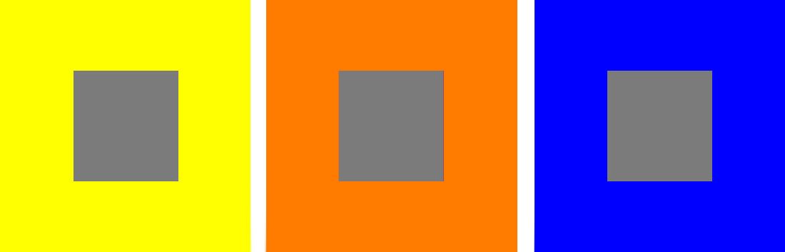
6. Colour Contrast of Quality
Quality describes the contrast of strong chroma colours against weaker ones as well as brighter or darker tones.
To achieve this, mix colours with grey or their complementary, or white and black.
The mixing of strong hues with these will lessen their intensity. This affects that they will appear greyer, blunter and cooler or warmer, brighter or darker, depending on the mix.
Placing intense colours against weaker ones as well as brighter or darker tones makes the high chroma ones stand out.
Colour Hierarchy:
Higher chroma (purer / stronger) colours advance and dominate.
Lower chroma ( greyed / weaker) colours of the same hue recede.

CONTEXT IS ALL: Also see simultaneous contrast
Low chroma, but brighter colours will advance before low chroma and darker colours.

Equally, same colour will look duller against a more intense or brighter one.

The eye is naturally drawn to the colours, which are more intense or brighter.
In a complementary pairing the same colour will look stronger. This effect is explained in the next chapter.

7. Simultaneous Contrast
Why do two colours, put one next to the other, sing? Can one really explain this? No. Just as one can never learn how to paint.
Pablo Picasso
With this chapter some of what Pablo Picasso pondered here might indeed be explained.
Simultaneous contrast highlights the reaction between areas of colour and their influence on colour perception. It is one of the most prevalent and affects all mentioned earlier.
If you ever thought that colours do something to you – well it is true –
There is always an influence that happens between colours.
What is the Simultaneous Contrast?
Adjacent colours will heighten or lessen the contrast between them beyond what is objectively present. “Really? “, you ask yourself, “that is amazing,“ and it is, but why?
This phenomenon is a physiological reaction of the optical nerve, a biological aspect.
The same is true for the successive and flicker contrast.
Our evolution did not focus on precision but survival. It was more important to distinguish a danger in the undergrowth than the true appreciation of two greens.
This might be a much more prosaic explanation than Picasso was looking for, however it’s influence on our aesthetic colour perception is still marvelous to experience and rich in nuances.
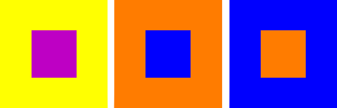
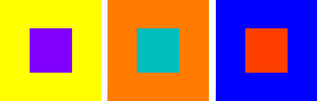
Whenever we see a colour, the eye will at the same time (simultaneously) perceive its opposite, the complementary, to create an equilibrium. This, in turn, reflects on the original and neighboring colours.
Try These Experiments:
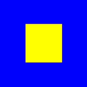
If you see a grey square on a yellow background, the eye will complement purple and the grey square will take on a purplish tint.
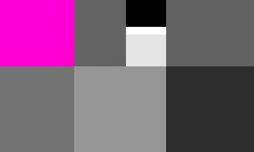
A grey square on a light grey background appears darker than the same square on a darker background. See also the examples below.
The fact that the after-image or simultaneous contrast is a psycho-physiological phenomenon should prove that no normal eye, not even the most trained one, is foolproof against color deception. He who claims to see color independent of their illusionary changes fools only himself, and no one else.
Interaction of Color, Josef Albers 1963
In Colour Context is All
Maybe the most important lesson to take away from this is: Our perception of colour is relative.
What surrounds a colour creates a colour to a degree. Furthermore, our colour sense is based on comparison.
A colour is stronger or weaker, brighter or darker, warmer or colder than.
For this reason, interior designers create material boards to show colours in their context.
Equally, graphic designers create guidelines. This regulates, amongst others, colour interactions.
Here is a great example, to experience this: https://www.youtube.com/watch?v=rnVhD-ke9Qg
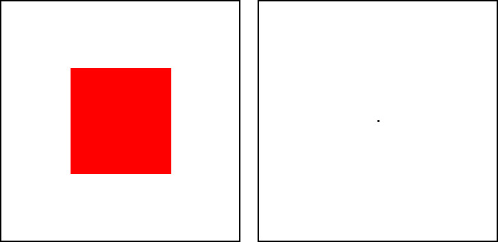
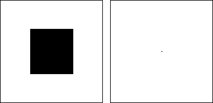
8. Successive Contrast
So back to the question of why surgeons wear green scrubs. This chapter explains it all.
As per the previously discussed simultaneous contrast, the successive contrast is a physiological reaction of the optical nerve. Furthermore, we have learned: The eye perceives the opposite when looking at a field of colour. It does so to create an equilibrium.
IF ONE LOOKS FROM ONE COLOUR TO (SUCCESSIVELY) A NEW AREA, THIS WILL:
- show the afterimage of the colour fields, seen before, (inducing field) as the opposite.
- retain the shape of the inducing field. This can be multicoloured.
- disappear after a few seconds.
Try These Experiments:
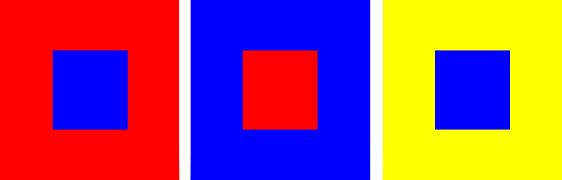
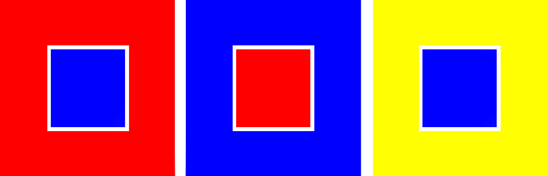
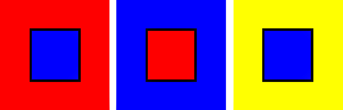
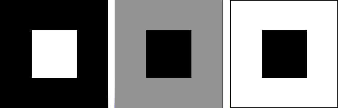
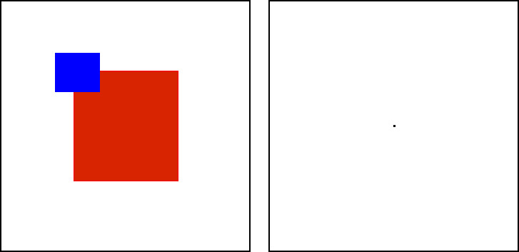
Look at the red square with one eye for 15 seconds, then look at the centre of the next square (marked by the dot).
You will see the previously red square in the complementary colour of green.
Observe the black square as before, then look at the centre of the next.
The black square is now the opposite, a white one.
In this third experiment regard the coloured squares once more for a period of time. Then, look at the centre of the next square.
This time, the previously red and blue squares will be a green and orange squares, the opposite. They retain the shape, too.
The Afterimage Shows as Follows:
- Colours become their complementary opposite. This works best with strong hues. In addition, weak ones create this effect, too.
- The tone becomes the opposite: Light colours become dark and dark ones become light.
The effect is created in the eye by looking at a colour field (red) for a longer time. This temporarily fatigues the cone cells in our eyes, which are responsible for seeing this colour. However, the remaining cells ( blue and green ) still show colours. Therefore it leaves the opposite colour, which is created at the same time, as an afterimage until your cells have recovered.
The effect of the successive colour contrast is important, because one would usually want to avoid it.
This is because it interferes with seeing, particularly at the workplace.
To Avoid After-Images, Do the Following:
- Reduce the difference of light and dark contrast between the object and it’s surrounding.
- Use weaker chroma colours, as this will create a weaker afterimage.
- Present the object and its surrounding in a colour contrast. Yes, you guessed right, this is the reason why surgeons wear green scrubs. It allows them to refresh their eyes to continue to see red nuances in body tissue. Furthermore no ghostly green after-images will disrupt their vision.
9. Flicker Contrast
As before, the flicker contrast is a physiological reaction of the optical nerve, a biological aspect.
It is a reaction to the luminosity of different colours.
IT INCREASES THROUGH:
- Fine shapes, such as lines
- Closeness of different colours
- Colour purity
- Equal luminosity
Green and red create the flicker contrast very easily. This is so, because the luminosity between these is equal.
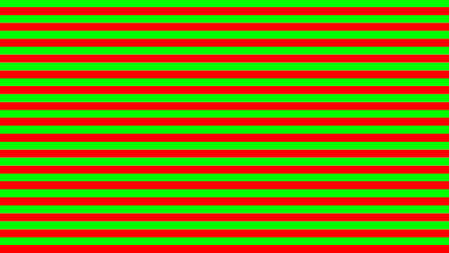
FURTHERMORE, OBSERVE IT WITH:
- full chroma colours of the same luminosity. Where the colours are weaker the flicker effect becomes weaker, too.
- colours and greys of the same luminosity. The effect is not as strong as, for example, between full chroma colours of equal luminosity.
- colours under direct strong light or very low light. This happens in summer at noon under a cloudless sky, or at twilight when colours are still barely visible. In both cases, the low differentiation of the colour luminosity creates a flicker effect, because of either too much or too little light.
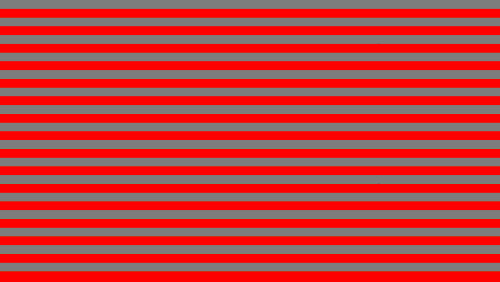
It is best to avoid the flicker contrast, because it is distracting and reduces readability.
To Reduce Flicker Contrast Do The Following:
- Change the luminosity of one of the colours.
- Create a light-dark contrast.
To Sum Up
In conclusion, to understand colour means to experience it and to keep working at it, consciously.
Johannes Itten gives the best advice himself to help master it:
Play becomes joy, joy becomes work, work becomes play.
Johannes Itten
Enjoy working with colour!
Finally, if you liked this post, you might find the others in the colour category interesting, too.
Be the first to receive new posts on the subject and subscribe.